
General Wealth Capital
General Wealth Capital
General Wealth Capital
What is General Wealth?
Gen Wealth Capital is founded in 2017 with more than 70 million yuan(10 million dollars) under its management and it is officially authorized by the Asset Management Association of China(AMAC). Gen Wealth Capital has been committed to technological development and innovation finance with its top quantitative trading team in the industry.
Client
General Wealth Capital
DELIVERABLES
Branding
Prints
Year
2014
Role
Brand Designer
Graphic Designer
Symbol of Trust: Geometry, Culture, and Intention
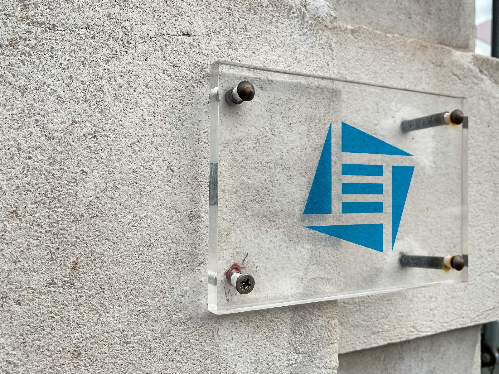
The logo design is grounded in precise geometry and spiral arrangements, reflecting the client's desire for a sense of order and discipline. Clean, simple forms establish visual clarity while conveying a feeling of structured strength.
The choice of blue as the primary color isn’t just aesthetic—it’s strategic. In color psychology, blue evokes calmness and intelligence. Within the finance sector, it's also deeply associated with trust, reliability, and expertise, reinforcing the brand’s credibility with its audience.
At the core of the mark, three central stripes subtly reference Qian—a powerful symbol from the Book of Changes (Zhouyi) representing the act of emergence and potential. In the context of finance and enterprise, Qian embodies ethical growth and sustained success: it signals a path where integrity leads to prosperity, not haste or short-sighted gain.
Together, these elements create more than a logo—they shape a visual identity that speaks to wisdom, trust, and long-term vision.


