
Context
Our goal is to translate the complexity of blockchain into a clear, approachable experience. We built a new design system to support a platform that makes NFT trading feel intuitive and accessible. Working in this space means tackling unique challenges—like demystifying smart contracts, addressing security concerns, and simplifying unfamiliar crypto terms. Most people just want to collect and trade digital art without the technical deep dive. Through thoughtful design, we help make that possible.
My Role
My focus was to make the platform feel as straightforward as browsing Craigslist—but with the elegance of a modern art gallery. We embraced a minimal design approach to give it a refined, curated feel that aligns with the world of contemporary digital art. To keep the spotlight on the NFTs themselves, we went with dark mode—allowing the artwork to stand out without distractions from flashy colors or clutter.
Target Users
Outland Art’s target users are digitally native artists, collectors, and curators who value thoughtful curation, strong aesthetics, and the intersection of contemporary art and technology.

Problem
Design Gaps That Held Users Back
In the earlier version of the platform, the visual style and interactions felt outdated, which made the experience feel disconnected from the digital art it aimed to support. Key features were also missing—users couldn’t easily browse highlighted works or make purchases with a single click. There was no crypto wallet integration, making transactions clunky. And without a central dashboard or links to social channels, there was limited opportunity for creators and collectors to stay connected beyond the platform.


New Design System
Building a Scalable System for Seamless Interaction
To improve consistency and usability across Outland Art’s mobile and web platforms, I partnered closely with the CTO and CEO to define a unified interaction model and layout structure. From there, we developed a flexible design system built to support both current needs and future growth.
The system includes a thoughtfully crafted component library—buttons, inputs, badges, chips, alerts, toggles, and more—ensuring smoother workflows for designers and developers. What makes this system effective is its balance of structure and flexibility: components are easy to adapt and extend, enabling the product to evolve without compromising clarity or consistency in the user experience.

User Survey and Interview
Grounding the Design in Real User Needs
After building the foundation with a flexible design system, I worked closely with the product manager and UX researcher to better understand how people actually wanted to interact with the marketplace. We launched an online survey to gather broad user feedback, then followed up with targeted interviews led by our UX researcher.
These one-on-one sessions included conversations with both artists and collectors—people already using the platform, as well as potential newcomers. From this, we uncovered valuable insights around common friction points, expectations for trading features, and what a truly smooth and trustworthy experience would look like. This research directly informed how we prioritized and shaped the next phase of product design.
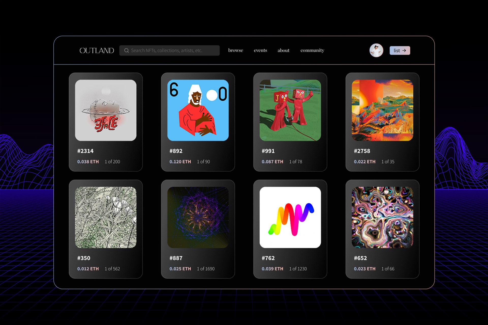
Solution 1: Searching & Saving
Streamlining Discovery with Smarter Filters
Through user feedback, we found that endlessly scrolling through listings felt overwhelming and inefficient. Instead, users wanted a faster way to narrow down their options and find exactly what they’re looking for.
To address this, we redesigned the filtering experience to be more intuitive and responsive. The new system allows users to quickly sort NFTs by category, price, rarity, and artist collection—minimizing friction and helping them reach relevant content faster. The result is a more personalized and goal-driven browsing experience that puts users in control.

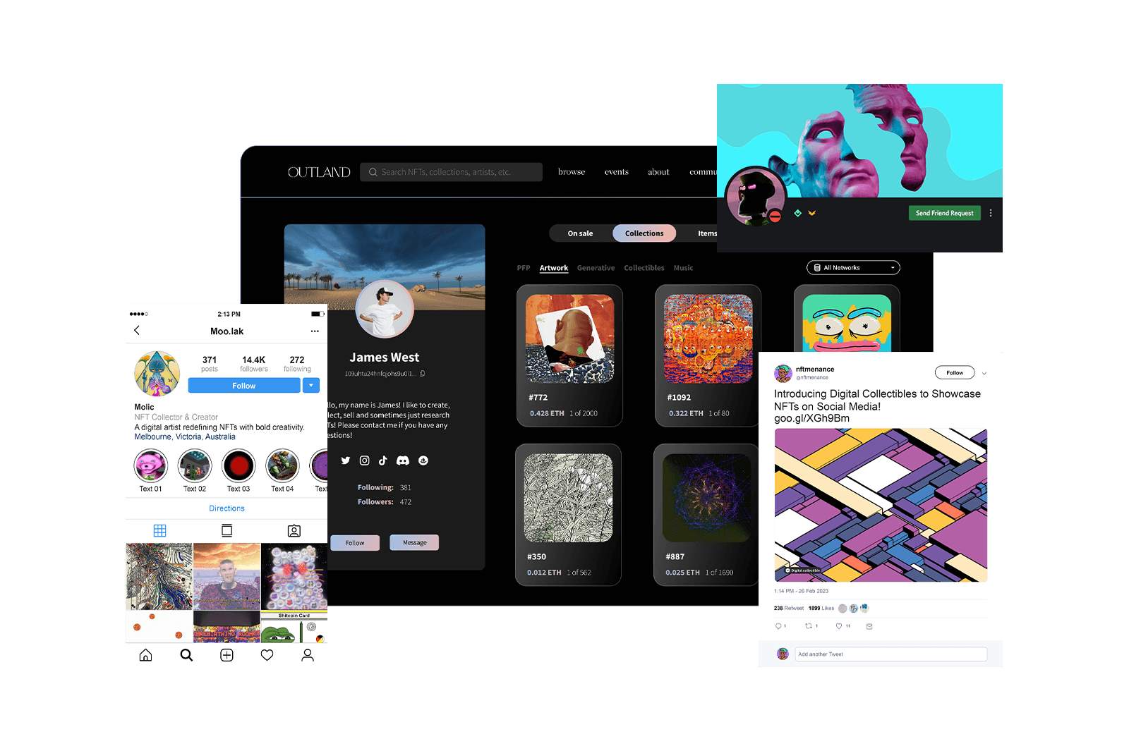
Solution 2: Building Community Through Personal Profiles
Designing Profiles as Community-Driven Hubs
We reimagined user profiles as more than just static pages—they’re dynamic, functional hubs for managing digital collections and staying connected. From a design perspective, the goal was to make ownership and discovery feel personal, effortless, and socially engaging.
Each profile lets users track saved NFTs and wallet activity without needing to dig through long lists or remember specific contract details. We also built in smooth social integrations with platforms like Discord, Twitter, and Instagram—making it easier to engage directly with artists, fellow collectors, and communities. This thoughtful structure supports not just utility, but also social connection and discovery—core parts of the digital art experience.

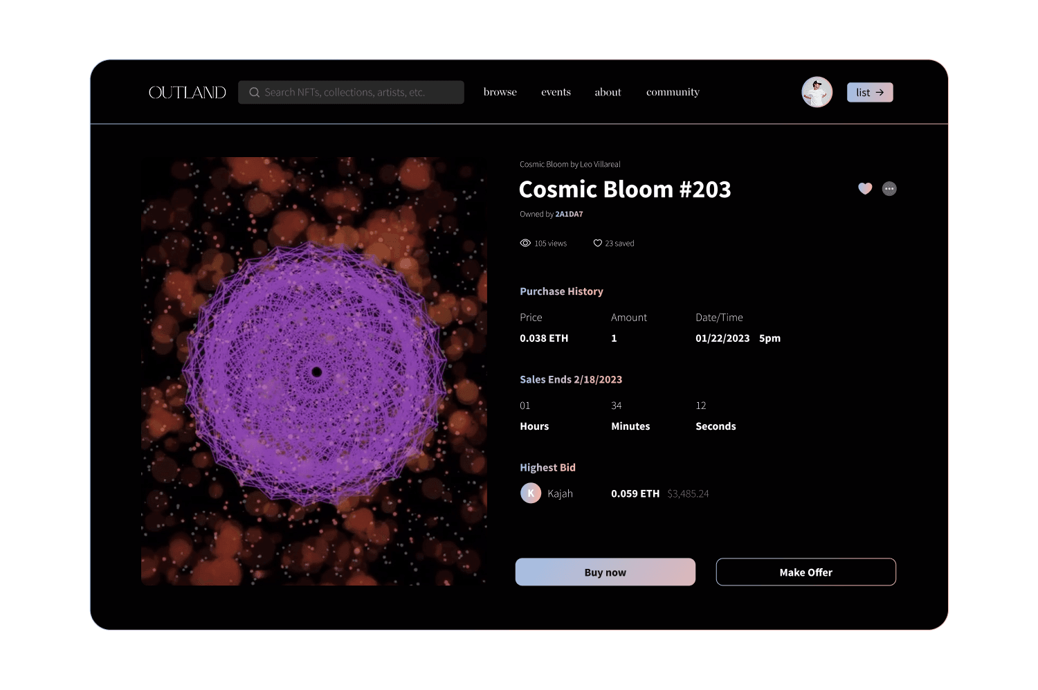
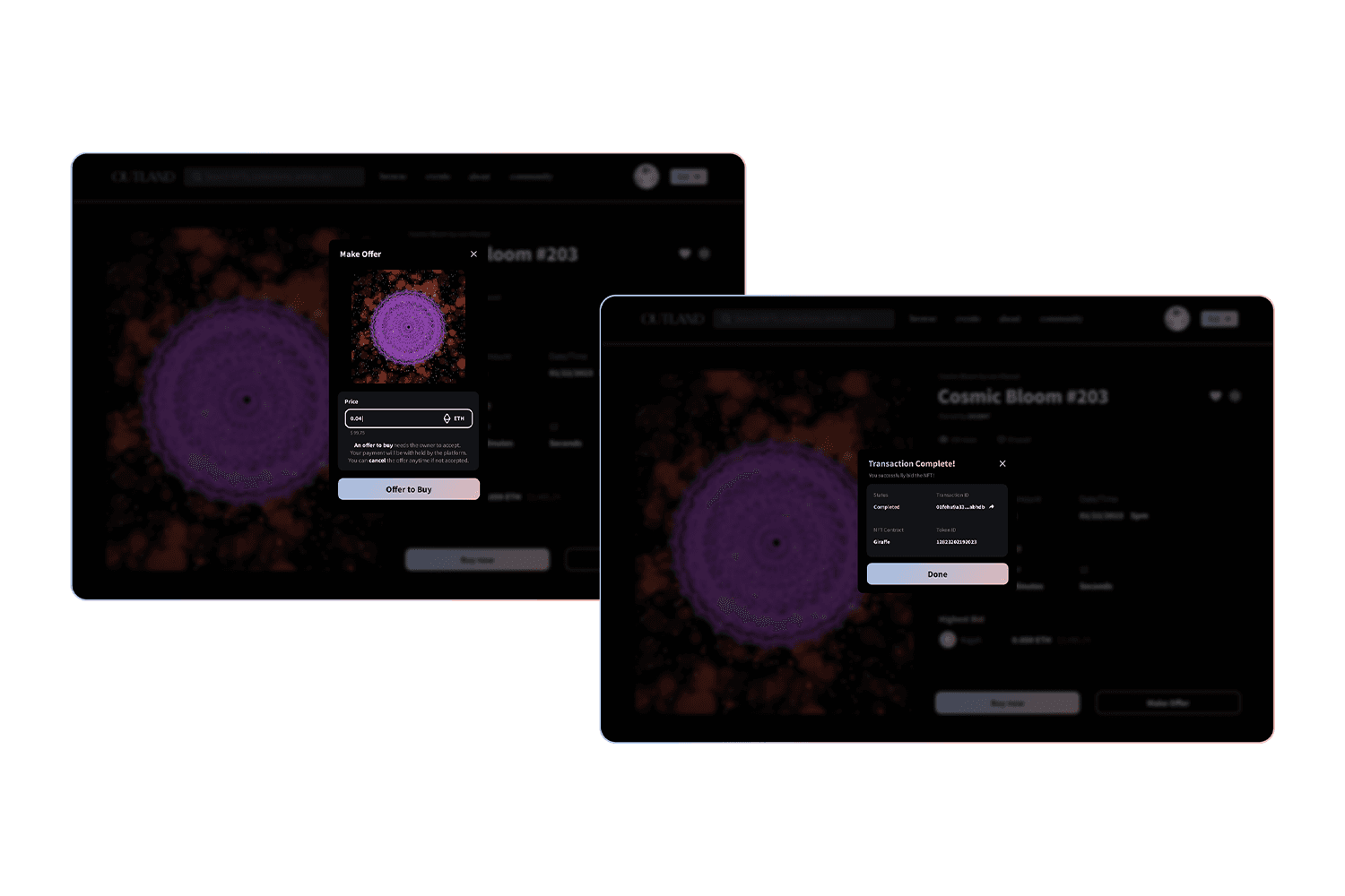
Solution 3: NFT History Tracking for Buyers
Designing for Transparency and Trust
To help users make confident decisions, we focused on making NFT histories clear, accessible, and easy to digest. Key details—such as creation date, past owners, transaction logs, and provenance—are displayed in a clean, structured format that’s accessible with just one click.
By prioritizing clarity and hierarchy in the layout, users can quickly verify an NFT’s authenticity, understand its value within a collection, and explore its journey over time. This design not only builds trust but also empowers users with the context they need to engage more thoughtfully with digital assets.

Final Outcome & User Feedback
Transforming Complexity into Clarity
Although I wasn’t directly involved in Outland’s user testing due to legal constraints, I worked closely with the CEO and CTO to analyze post-launch feedback. The findings showed strong alignment between user needs and the updated experience—users were able to navigate the platform smoothly and complete key tasks on the landing page with ease.
Key design improvements—like personalized profiles, smarter search filters, and simplified bidding flows—helped reduce friction and made core actions more accessible. These updates significantly improved how users discover, track, and interact with NFTs, leading to increased engagement and more active buying, selling, and bidding behaviors.
While a full site revamp was postponed due to budget, the redesign successfully balanced function and aesthetics, modernizing the product without overwhelming users. Feedback from the team and users alike confirmed the impact: a more intuitive, engaging, and efficient marketplace experience that drives value for both creators and collectors.
Additional Images
Scroll down to view more images!


