Why Good&Co Needed a Rebrand
Good&Co underwent a rebrand in 2019 to align its visual identity and user experience with its evolving mission of helping companies build balanced, productive teams through culture-fit hiring. The existing branding no longer reflected the company's expanded focus on both B2B and B2C markets, nor did it support the growing suite of digital products, including mobile and web applications.
Client
Good&Co. Labs
DELIVERABLES
Visual Identity
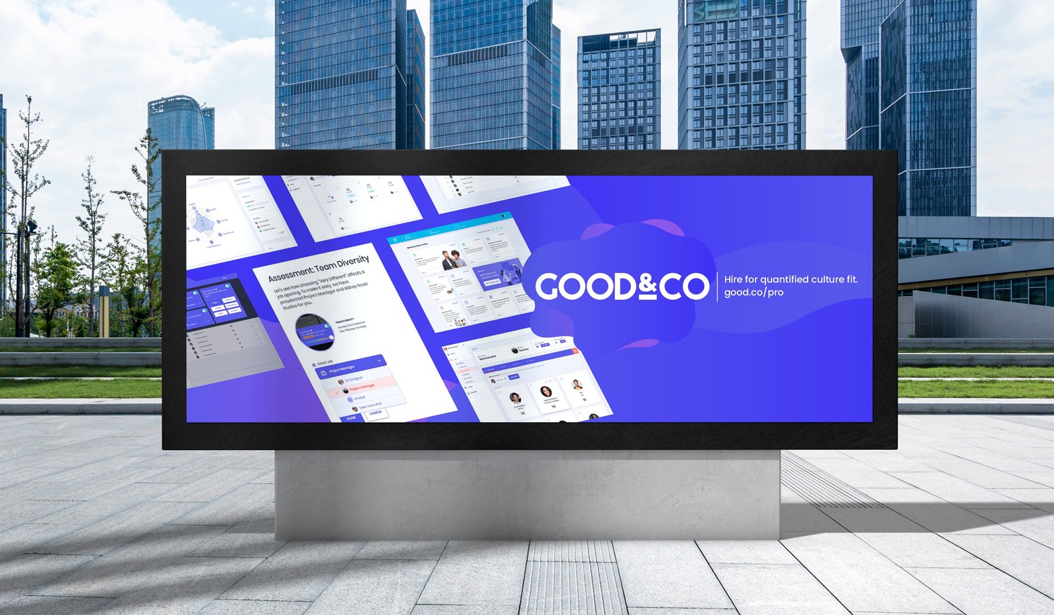
Web | Mobile App Update
Marketing Materials
Year
2018 - 2019
Role
Brand Designer
Graphic Designer
Rebranding for Growth and Alignment
My Roles
As the visual and branding designer, I led the redesign of Good&Co’s company-wide branding system—from visual identity and logo iterations to design guidelines and component libraries. I maintained and evolved the system post-launch to ensure consistency and scalability. Alongside this, I also managed the end-to-end product design process for both B2B and B2C platforms, across iOS and web. One of the most rewarding and challenging aspects of this project was collaborating closely with the CEO to bring their vision to life through a brand that felt modern, clear, and true to the company's mission.
Branding Redesign
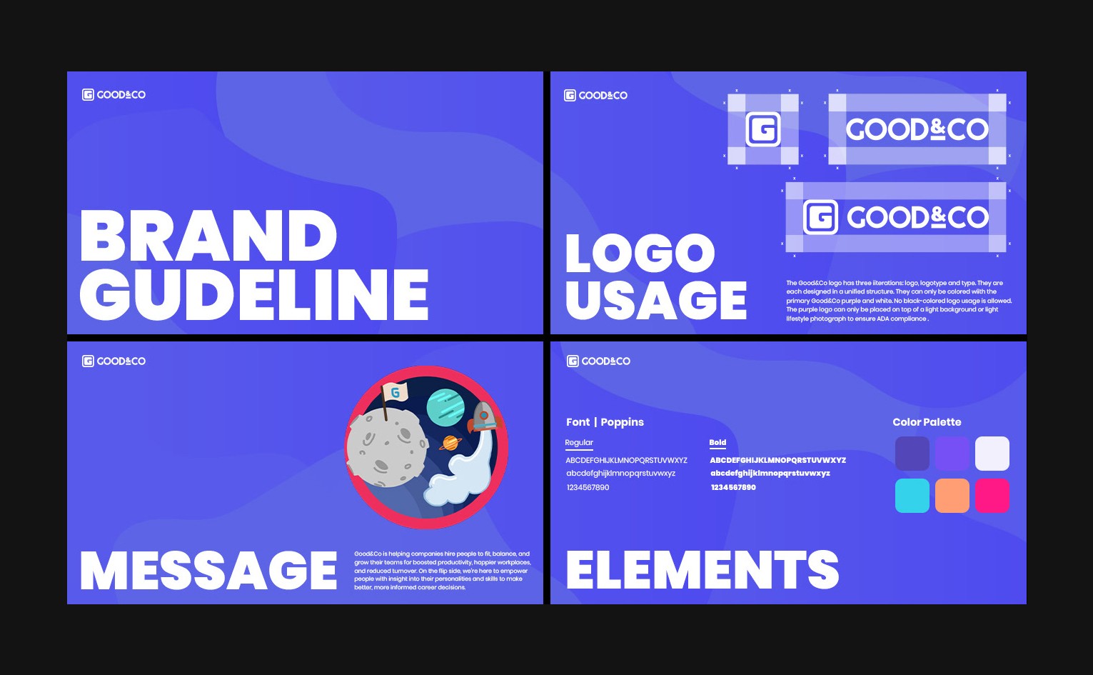
Visual Identity: From Concept to Grid
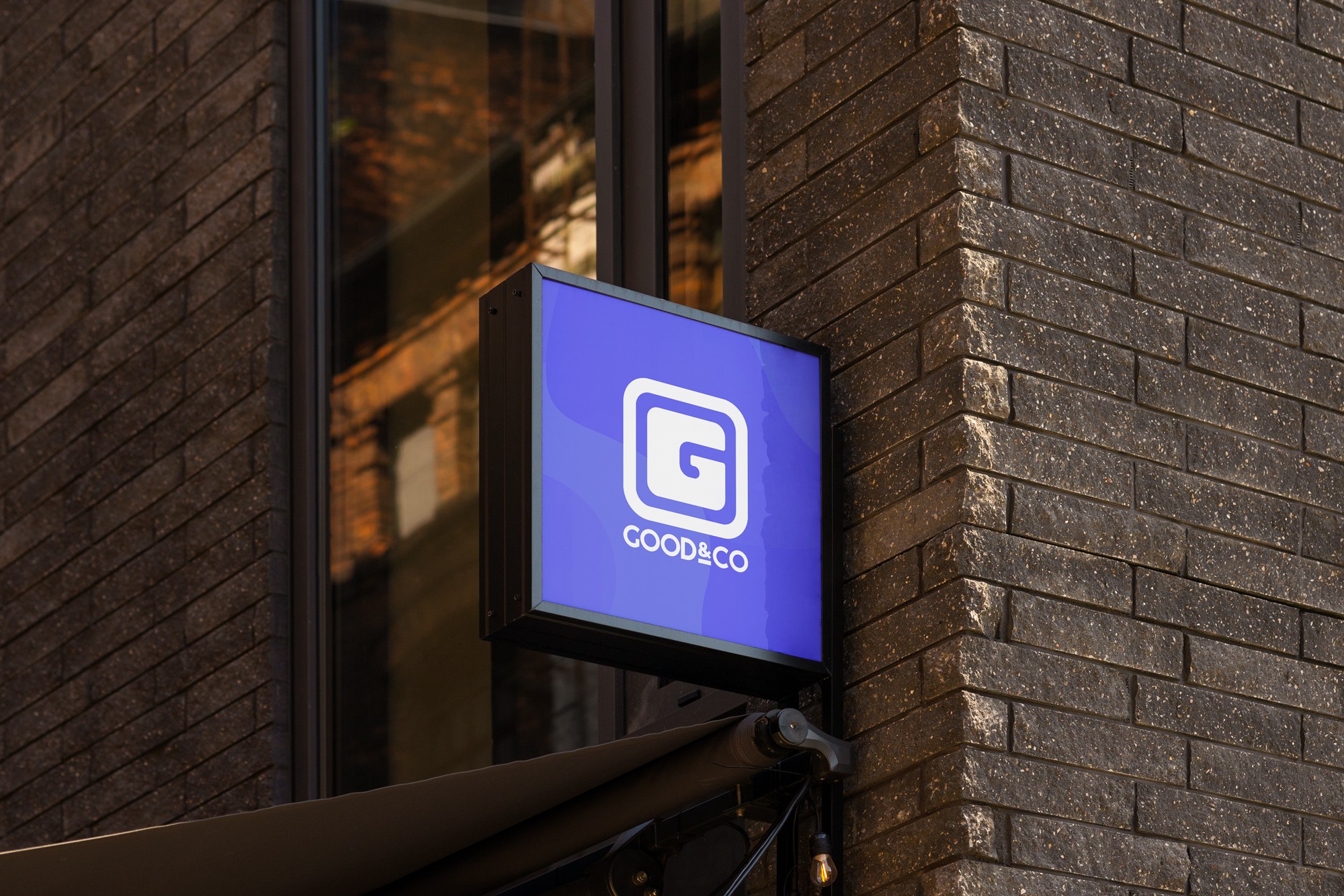
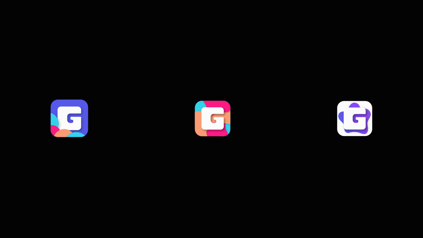
The updated Good&Co logo was designed to establish a stronger visual identity with improved balance, scalability, and legibility. The new logomark preserves the original concept of a monogram “G” inside a container but introduces a bolder, rounded square and simplified geometric lines to create a modern and approachable feel.
The layout follows a modular grid system that ensures consistent spacing and alignment across different formats. By using consistent proportions (e.g., "X" and "X/2" padding rules), the logo maintains visual harmony whether used as a standalone icon or paired with the wordmark. This structured approach not only strengthens brand recognition but also supports seamless integration across web, mobile, and marketing materials.

Logo Iteration
Designing for Culture Fit
This playful logo animation brings our brand personality to life. Inspired by San Francisco—our hometown—it’s filled with fun visual cues from company culture: coffee breaks, lightbulbs for big ideas, office life, and even happy hour.
Every detail reflects the heart of our mission: you’re happier and more productive when you work at a company that truly fits you. This is more than branding—it’s a celebration of what we believe in.

Branding Materials & Events
Bringing the Brand to Life