Culture-fit Job App
Soft-skills assessments that are proven to predict performance.
What is Good&Co Culture-fit job app?
Culture Fit Job App helps users discover their ideal workplace culture through engaging, bite-sized personality assessments powered by Good&Co. As users complete more quizzes, their personalized profile evolves, offering deeper insights and stronger job matches tailored to their unique strengths and preferences.
My Role
While collaborating with the product design team, I play a key role in refining the Culture-fit Job App following the launch of V1. I collaborate closely with the product manager, engineers, data analysts, and leadership to identify pain points and opportunities based on both qualitative and quantitative insights. My main focus is on elevating the visual design while also improving the app's usability, ensuring a more seamless and engaging experience for users. Through an iterative design process, I translate data-driven findings into actionable solutions that drive meaningful product enhancements.
Problem of V1
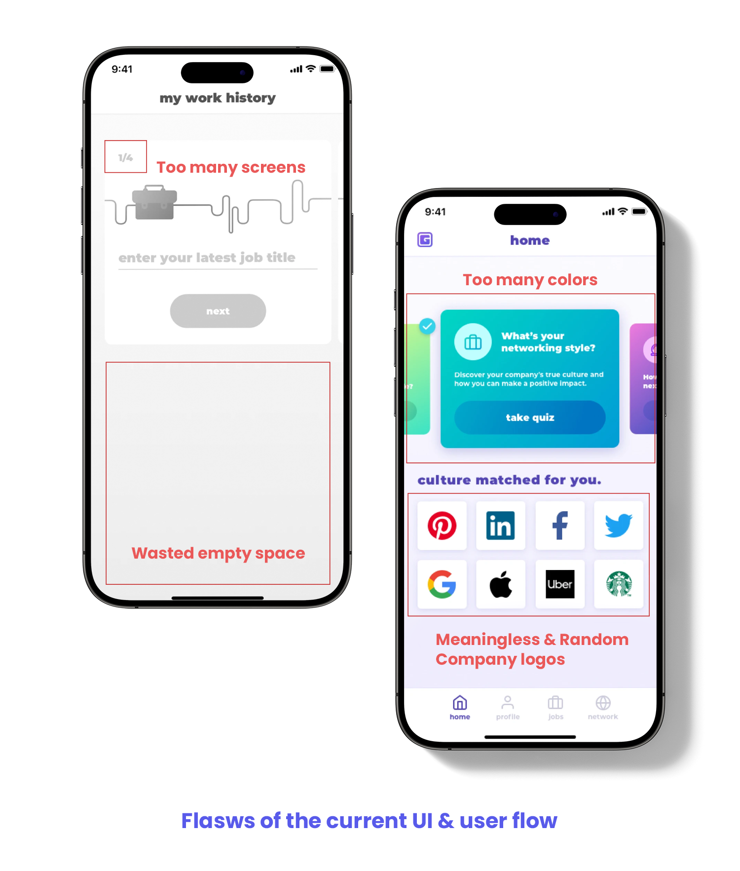
1. There is a notable drop-off at the work history section during onboarding, leading to a completion rate of only 52.70%.
2. Job searching engagement is lower than expected, with a usage rate of just 19.94%.
3. Quiz completion rate is low.
4. The excessive use of colors creates visual clutter, impacting layout clarity and hierarchy.
Research & Interview
Leveraging data and user feedback, I collaborated with product team, dev team and UX team to evaluate the strengths and weaknesses of the Culture Fit Job App. For this project, we prioritized enhancing the onboarding experience and refining the home screen to create a more engaging and intuitive user journey.
Key Takeaways
1. The work history section in onboarding had too many steps, causing friction in the user flow.
2. After completing onboarding, users lacked clear feedback on how well they matched with potential jobs.
3. The quiz widgets on the home screen used an overly complex color palette, reducing text readability—especially for color-blind users.
4. Company logos on the home screen did not provide meaningful value to users, leading to unnecessary visual noise.
How to Improve
1. Streamline the onboarding flow to reduce completion time and improve efficiency.
2. Improve the job matching screen for better usability and clarity.
3. Redesign the home screen to drive engagement, encouraging users to complete more quizzes for improved job recommendations.
4. Optimize the user interface, visual hierarchy, and feedback mechanisms to provide greater value and clearer guidance.

Competitive Analysis & Insights
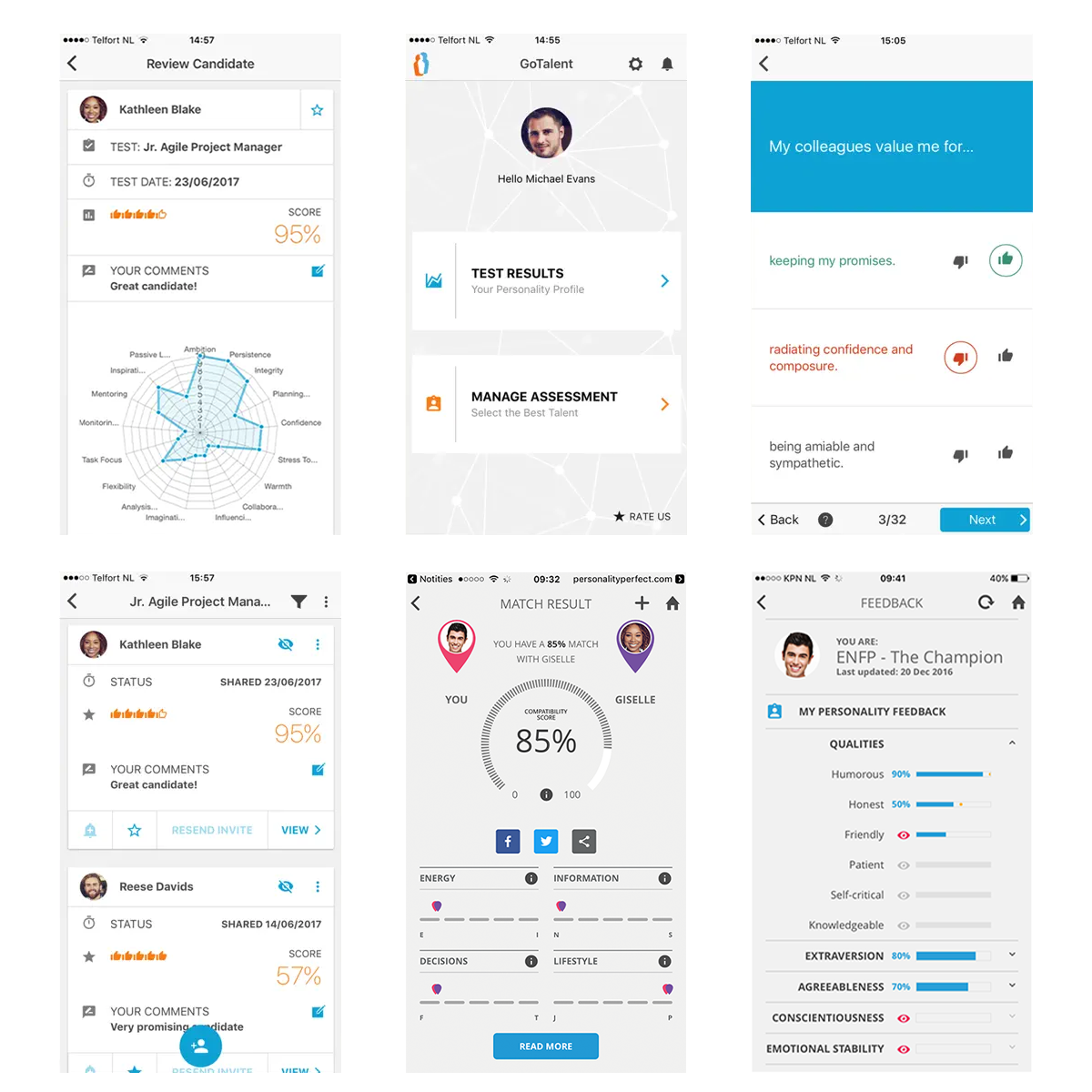
We conducted a competitive analysis of PersonalityMatch and GoTalent Job Personality Test to understand how they address key challenges through their use cases and business strategies. This research provided valuable insights into effective approaches and areas for improvement.
Strengths:
Onboarding flows are simple and easy to complete.
Users receive instant access to their personality results, including strengths and weaknesses.
Opportunities for Improvement:
None of the applications provide a clear indication of how well users match with potential jobs.
User Journey for New Onboarding Experience
In the redesigned onboarding flow, I streamlined the work history input by consolidating job title, location, company, start date, and end date into a single screen, minimizing friction and reducing completion time. After completing Quiz 1, users can seamlessly transition to viewing their matched jobs or navigating to the home screen.
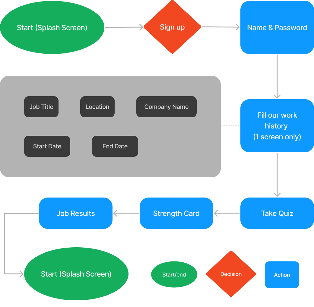
Optimizing Work History in Onboarding
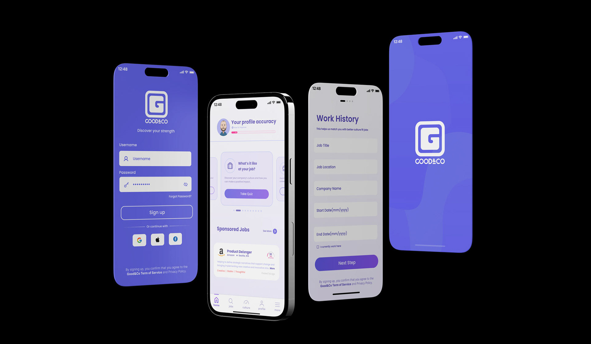
The previous work history flow involved multiple steps and screens, making it difficult for users to track their progress and know what to expect next. To improve clarity and efficiency, I redesigned the experience by consolidating all work history fields into a single screen, making the process more straightforward and intuitive.
In the updated onboarding flow, I designed a simplified work history section to reduce friction, followed by a tutorial screen that encourages users to complete Quiz 1 while highlighting their progress toward their ideal job. After Quiz 1, users can immediately access a job screen that helps them explore their personality insights and begin searching for jobs right away.
In the updated onboarding flow, I designed a simplified work history section to reduce friction, followed by a tutorial screen that encourages users to complete Quiz 1 while highlighting their progress toward their ideal job. After Quiz 1, users can immediately access a job screen that helps them explore their personality insights and begin searching for jobs right away.

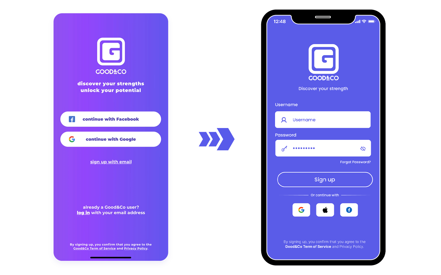
Improving the Sign-Up Experience
I redesigned the sign-up screen to enhance its visual clarity and professionalism. Instead of limiting registration to Facebook and Google, I introduced the option for users to create an account with a username and password, accommodating those with other email providers like Hotmail or Yahoo. For users who prefer third-party sign-ups, I replaced the long buttons with compact Facebook, Apple, and Google icons to reduce unnecessary space. Additionally, I removed the gradient background and applied a solid primary color from the design system, creating a cleaner and more polished look.
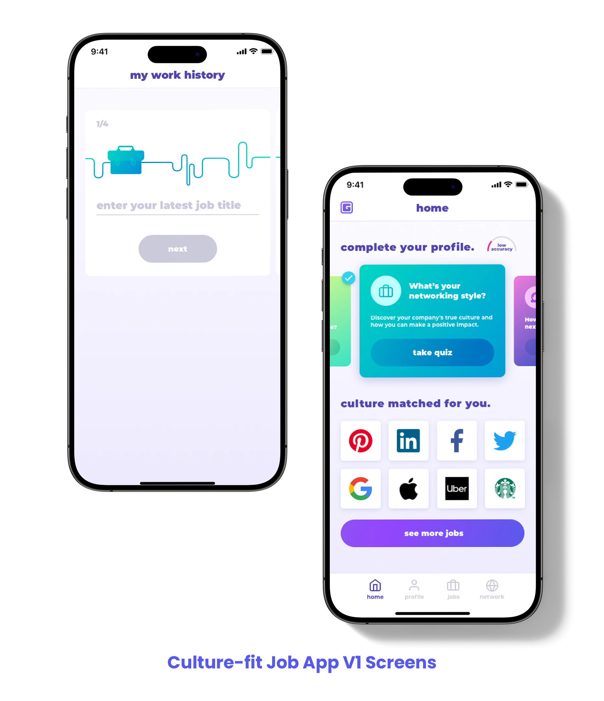
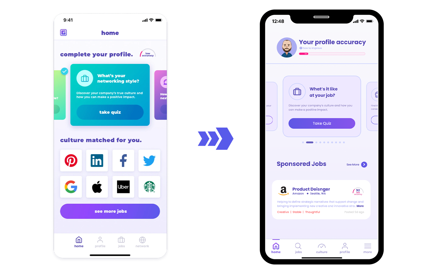
Redesigning the Home Screen to Drive Engagement
Beyond improving onboarding, I also reimagined the home screen to create a more engaging and intuitive experience, aiming to boost quiz completion rates and enhance job discovery. By refining the visual hierarchy, simplifying navigation, and ensuring key actions are more prominent, I designed a home screen that not only encourages users to complete more quizzes but also provides clearer pathways to explore personalized job matches.
In the new design, I replaced the quiz arch chart with a clearer progress bar, refined the quiz color palette for better readability, and emphasized the "Take Quiz" button to encourage participation. Additionally, I removed random company logos and introduced job results instead, helping users quickly identify potential dream jobs and explore more opportunities on the job page.
Measuring Success: Impact of the Redesign
The second version launched in late September 2019, leading to significant improvements in user engagement and task completion.
Increased Onboarding Completion (~65% ↑)
The redesigned onboarding flow, featuring a simplified work history modal, made the process more intuitive and user-friendly. As a result, registration completion increased by 10%, rising from 52.7% in September to 62.46% in October, 64.72% in November, and 62.49% in December.
The redesigned onboarding flow, featuring a simplified work history modal, made the process more intuitive and user-friendly. As a result, registration completion increased by 10%, rising from 52.7% in September to 62.46% in October, 64.72% in November, and 62.49% in December.
Boosted Job Search Engagement (~40% ↑)
By placing the "Look for Job" action at the end of the registration process and surfacing recommended jobs on the home screen, users found it easier to explore opportunities. The job search rate improved from 19.94% in September to 41.07% in October, 38.66% in November, and 44.42% in December.
By placing the "Look for Job" action at the end of the registration process and surfacing recommended jobs on the home screen, users found it easier to explore opportunities. The job search rate improved from 19.94% in September to 41.07% in October, 38.66% in November, and 44.42% in December.
Higher Quiz Completion Rates (60% - 117% ↑)
Enhancing the visual hierarchy and making the "Take Quiz" button the primary action on the home screen significantly increased quiz participation, leading to a 60% to 117% rise in quiz completions.
Enhancing the visual hierarchy and making the "Take Quiz" button the primary action on the home screen significantly increased quiz participation, leading to a 60% to 117% rise in quiz completions.