GenWealth Capital
Branding design for a cutting-edge securities company.
My role
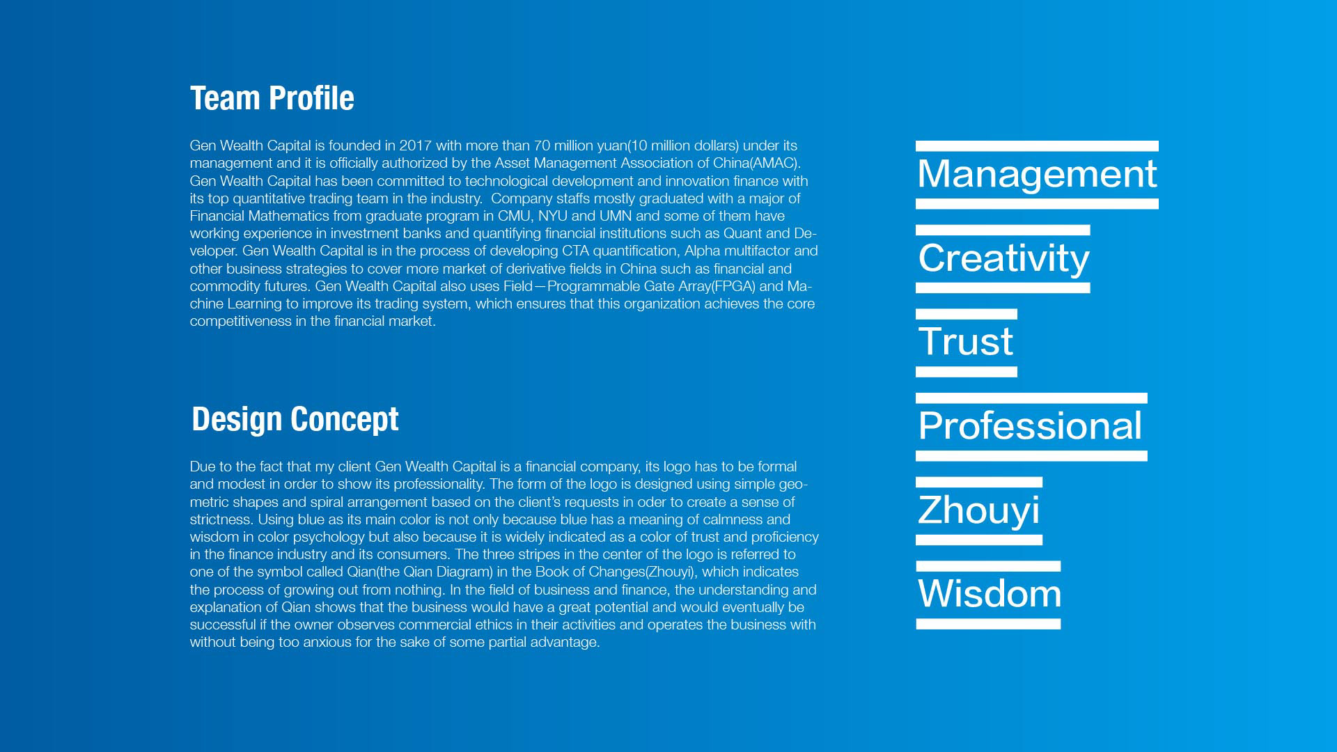
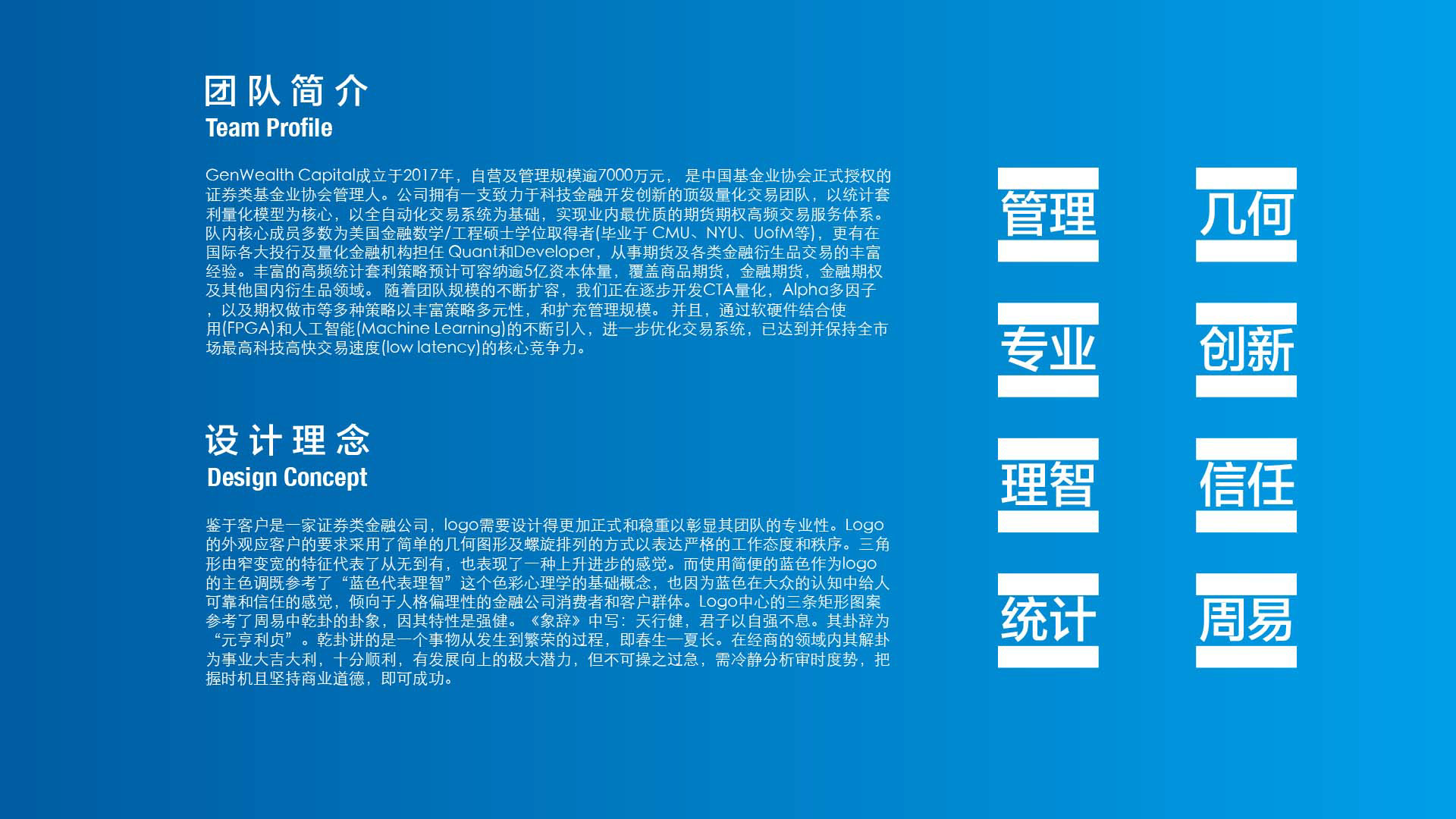
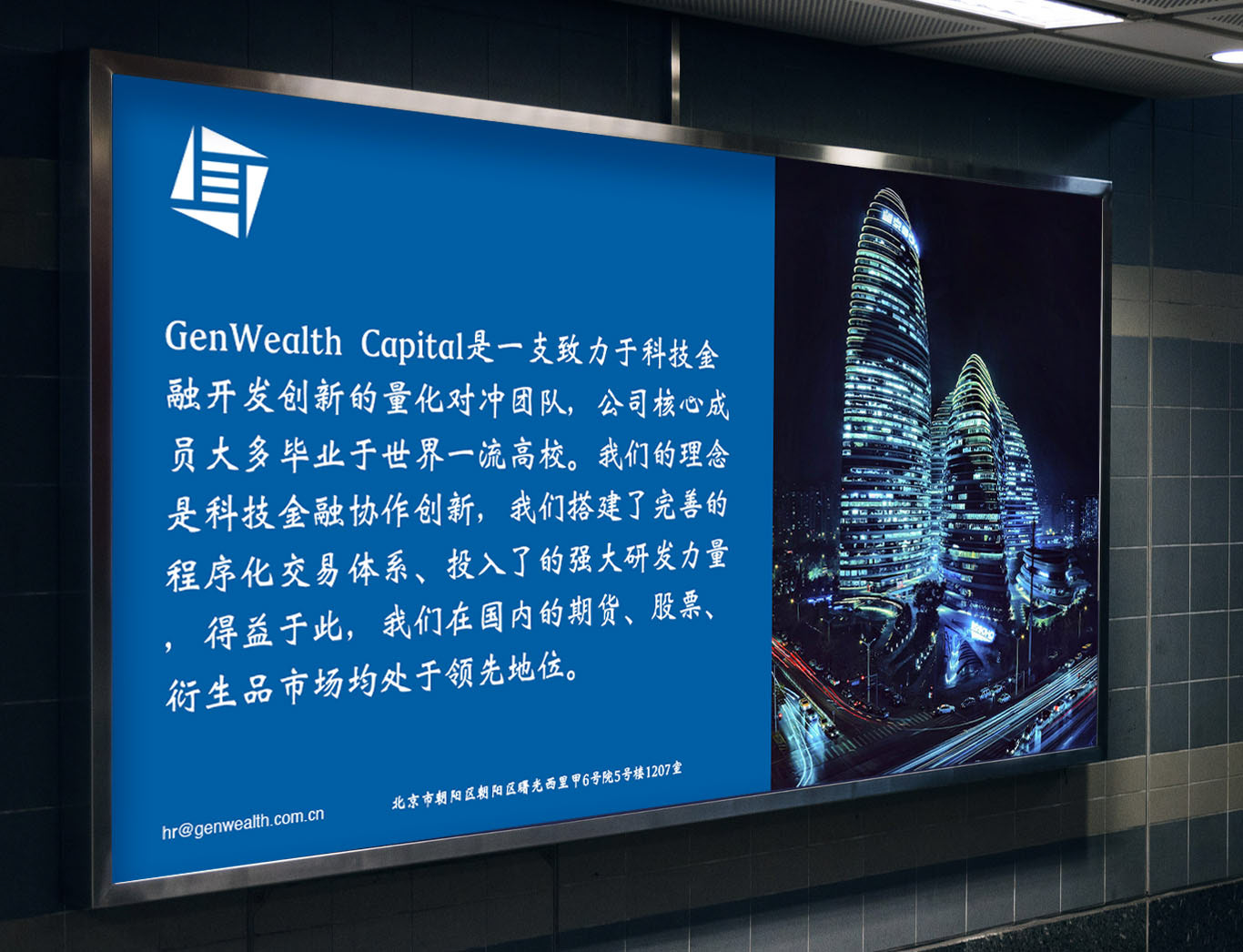
Gen Wealth Capital is founded in 2017 with more than 70 million yuan(10 million dollars) under its management and it is officially authorized by the Asset Management Association of China(AMAC). Gen Wealth Capital has been committed to technological development and innovation finance with its top quantitative trading team in the industry.
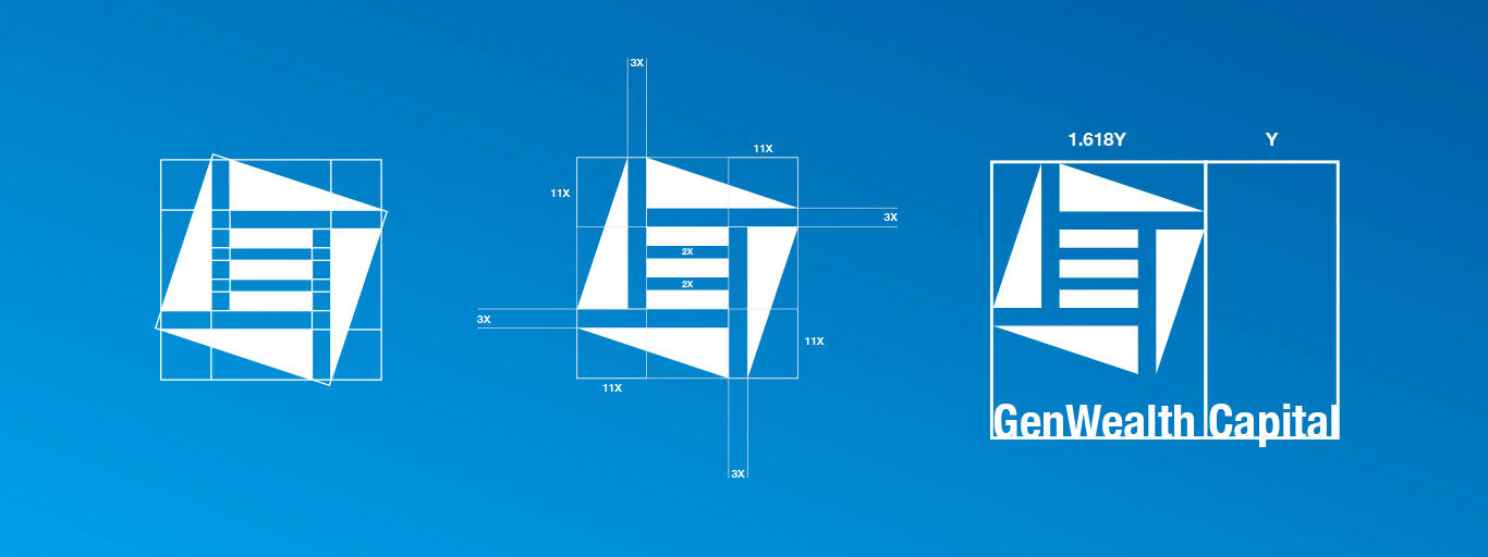
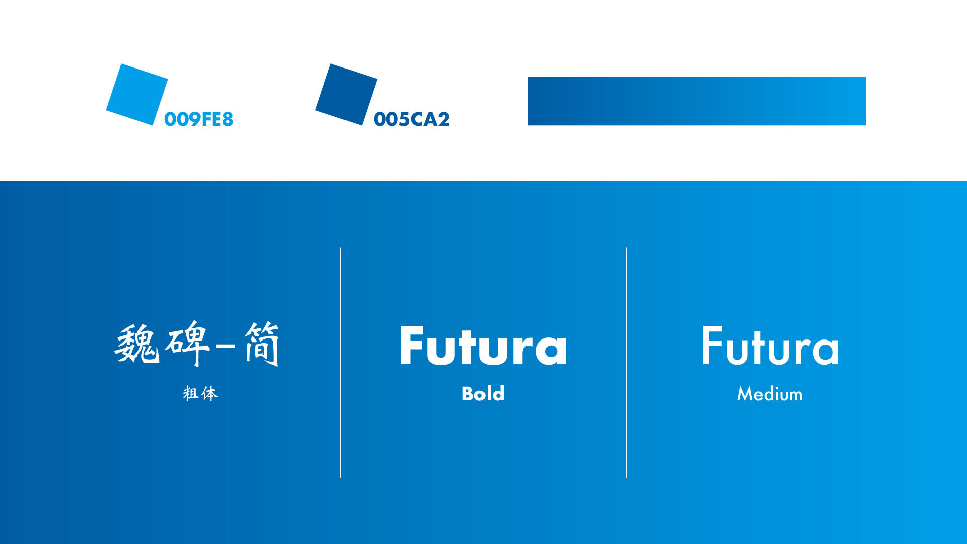
The form of logo is designed using simple geometric shapes and spiral arrangements based on the client’s requests in order to create a sense of strictness. Using blue as its main color is not only because blue has a meaning of calmness and wisdom in color psychology but also because it is widely indicated as a color of trust and proficiency in the finance industry and its consumers. The three stripes in the center of the logo are referred to as one of the symbols called Qian(the Qian Diagram) in the Book of Changes(Zhouyi), which indicates the process of growing out from nothing. In the field of business and finance, understanding and explanation of Qian show that the business would have great potential and would eventually be successful if the owner observes commercial ethics in their activities and operates the business without being too anxious for the sake of some partial advantage.